Get Started
VisFlow Demo
You may try out VisFlow using the online demo. No login is required to use the demo. You may complete all the steps below under the demo mode.
Load a Dataset
Drag a Data Source
onto the canvas. Click on the created data source and its option panel will pop up on the right of the screen. Click in the option panel to select a dataset to load in the data source.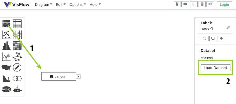
Demo Datasets
A few sample datasets are available under the demo mode. If you would like to use a custom dataset, you need to create an account and upload it. To create an account, click
at the top-right corner and then click .Create a Visualization
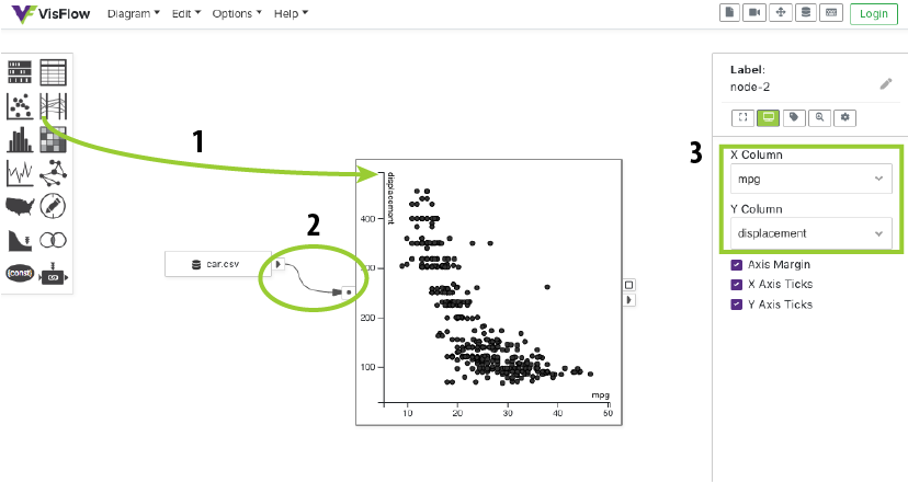
Let's create a Scatterplot
to visualize the dataset we just loaded. After dragging a scatterplot to the canvas, build an Edge that connects the Output Port of the data source to the Input Port of the scatterplot. To create an edge, you may drag from the output port and drop it either at the scatterplot node or its input port.You may change the X Column and Y Column and other settings of the scatterplot in its option panel.
Keyboard Shortcut
You may press the A key to use the quick node panel. The quick node panel can be used in a same way as the node panel. You may drag a node from the quick node panel to create it, or even search for node types. Refer to the Shortcut page for more shortcuts.
Forward Interactive Selection
Interactive selection in a visualization can be forwarded to another node for detailed exploration. We can create a Table
to inspect the selected points in the scatterplot. Connect the Selection Port of the scatterplot to the Input Port of the table. When the selection in the scatterplot changes, the newly selected rows are reactively shown in the table.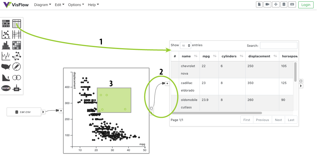
Moving Visualization Nodes
The default mouse action on a visualization node is interactive selection. Dragging a visualization may select the data items in the visualization, rather than moving the visualization node. To reposition the visualization node, hold ⌥ and drag.
Port Hovering
You may hover over every port to see how many data items pass through that port. For example, to find out how many data items you have selected, hover over the selection port.
Highlight Interactive Selection
VisFlow allows you to assign visual properties to data items so that interesting subsets of the input data can be brushed and linked across multiple visualizations. You may use a Visual Editor
to set the visual properties on the data items. In this example, let's highlight the selection from the scatterplot in a histogram.First create a visual editor for the selection from the scatterplot. Set the Color visual property to red in the option panel of the visual editor.
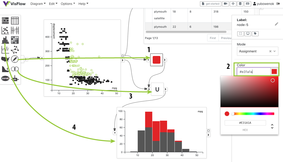
Then create a Set Operator
and set its Mode to Union. Merge the highlighted selection into the full dataset by connecting both the Output Port of the visual editor and the Output Port of the scatterplot to the Multiple Input Port of the union node. Finally create a Histogram and connect it to the Output Port of the union node.This flow diagram shows the distribution of the selected data points from the scatterplot in the histogram.
Filter the Data
You may add an Attribute Filter
to find data items based on their attribute values. In this case let's find the cars that have an American origin.Create an attribute filter and connect it to the Selection Port of the histogram. Keep the filter type as Pattern filter, and set the column to be origin in the option panel. Add a pattern American in the patterns list below.
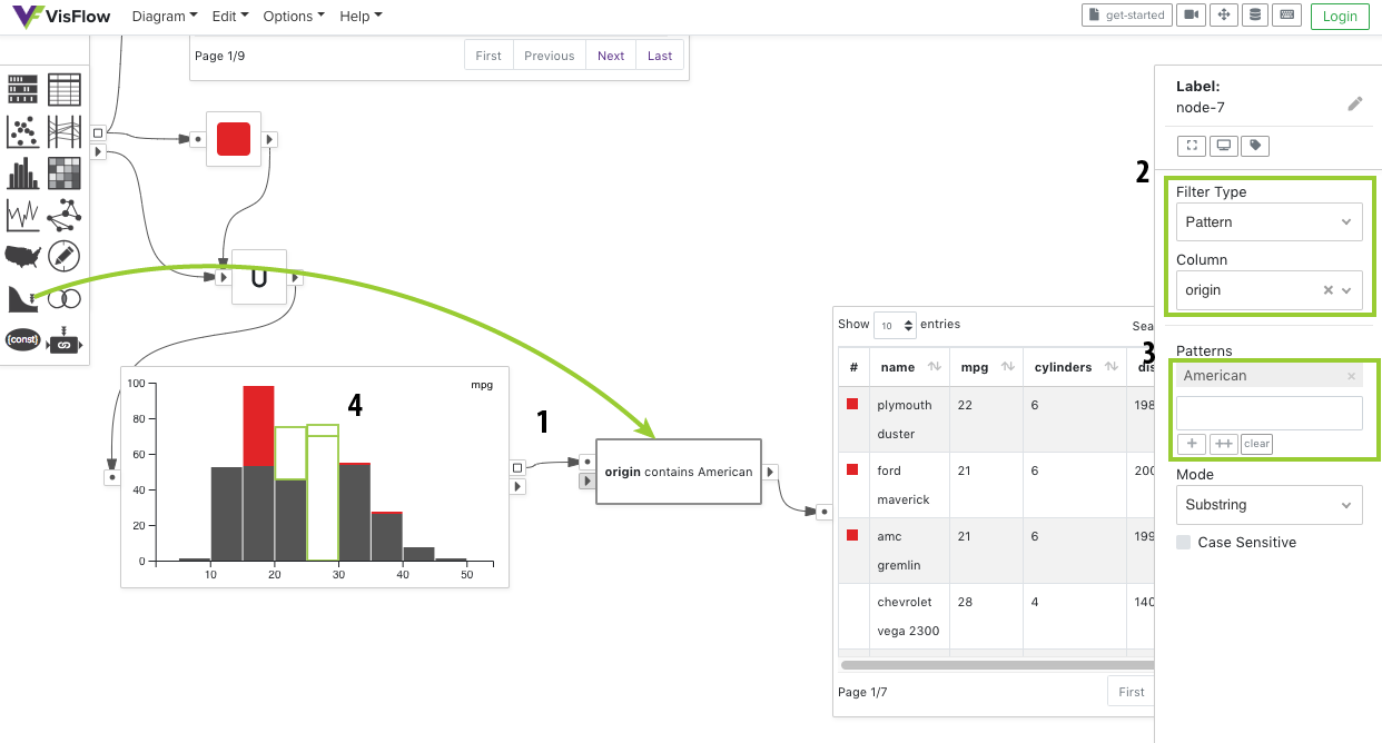
Now draw a rectangular box to select a few stacked bars in the histogram. The attribute filter will find among the selected cars in the histogram those that have an American origin. To show the details of those cars, we may further add a Table
. Feel free to explore other filter types as you like. For more details on how to use an attribute filter, see the attribute filter documentation.Subset Flow
You may have noticed that the red color assigned earlier by the visual editor keeps in effect in the histogram and the table. This is because VisFlow uses a subset flow model that renders everything with respect to their visual properties.
In the subset flow, all data transmitted in the dataflow are subsets of table rows from an input table. The input table rows are never mutated, except that visual properties can be assigned and modified down the dataflow. Such a design ensures that visual properties can be used to keep track of subsets unambiguously, so that brushing and linking can be well supported for visual data exploration.
Working with Multiple Tables
If you have more than one input table, you may relate them using table linking. A Linker
may be used to find table rows from one table using the attribute values extracted from the other table. Technically, a linker extracts the attribute values from one table as constants, and use those constants to filter the other table. Read more about the diagram elements definitions here.Next Steps
That's it! You have successfully completed the basics of VisFlow. Learn more about the dataflow model behind VisFlow in the Dataflow Section. Checkout the Node Types in VisFlow for the detailed usage of each node type.
Alternatively, you may go ahead and freely explore VisFlow yourself. Remember to come back whenever you have questions about specific aspects of the system.