Scatterplot
renders a scatterplot chart with two axes, presenting a visualization for two columns of the data. Each data point is represented by a circle.Example
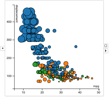
A scatterplot showing mpg and displacement of cars: The sizes of the circles represent the horsepower of the cars. The colors of the circles represent the origin countries of the cars.
Selection
Drag and draw a rectangular selection box to select data items inside the box.
Visual Properties
| Type | Effect |
|---|---|
| color | Fill color of the circle |
| border | Border color of the circle |
| size | Diameter of the circle |
| width | Width of the circle border |
| opacity | Opacity of the circle |
Options
X Column
Configures the column visualized on the X-axis.
Y Column
Configures the column visualized on the Y-axis.
Axis Margin
Uses 10% of margin on both sides of the axes.
Use Dataset Range
Sets the axes domain to always equal to the value ranges of the entire dataset, rather than the value ranges of the subset received by the scatterplot.
More Settings
Disable Transition
Disables the animation between data updates. This is useful for showing movement data combined with an attribute filter that filters by timestamps. For movement data the data entities are not identified by row indices, and animation cannot be correctly performed.
Transparent Content
Sets the background of the scatterplot to be transparent. This allows the scatterplot to be overlaid on an image, and is useful for showing movement data.